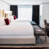
 A few months ago, I started noticing something on my hotel beat. Every time I went to tour a newly renovated hotel, I experienced deja vu. Then, it escalated. Before I even saw the rooms, I had a pretty good idea of what they’d look like.
No, I didn’t develop ESP. No, visions of tufted headboards weren’t coming to me, “Long Island Medium”-style.
It’s just that for the past two years, nearly every renovated hotel room looks the same: gray and white, and always — ALWAYS — with a whimsical pop of color.
That color may be magenta, green or tangerine. Lately, it’s more often been along the lines of blue or purple. But it’s always there, in a throw pillow, a lamp base or an accent wall, daring you not to notice it, screaming at you, “Look how fun I am!”
Click on the gallery above to see examples across the Washington region of this color shift.
So how did this happen? Was there some kind of massive color convention? The trend stretches across brands, hotel chains…


