WASHINGTON — World-class cuisine is as close as your smartphone.
A few taps, a few minutes, ding-dong and bada-bing: Hot sambusas are sitting on your doormat while you’re chilling on the sofa.
Talk about convenience. Why even go to a restaurant? In D.C., restaurant goes to you.
Or some of it anyway. Yes, you’re nom-nomming premium yum-yums at home, but you’re not truly dining out. No offense to your living room — it just lacks a certain ambience.
A restaurant, after all, is more than a place to eat. It’s a theater for meaningful human connection, so much so that a few New York restaurants have been employing actual theater and film designers.
In D.C. — another city full of exceptional food and disposable income — this sense of theater can be the difference-maker in a restaurant’s success. And restaurant designers are doing just as much work setting the scene as chefs do plating the meal.
Knowing the audience
Like good theater, good restaurant design should evoke a feeling. It should resonate with a diner and ensure return visits. As Jason Maringola, Streetsense’s design director for interior architecture, puts it, “It’s really about the emotional experience.”
“It starts at the door when the host or hostess greets you, and the way that they greet you and make you feel as you’re walking through the space,” he said.
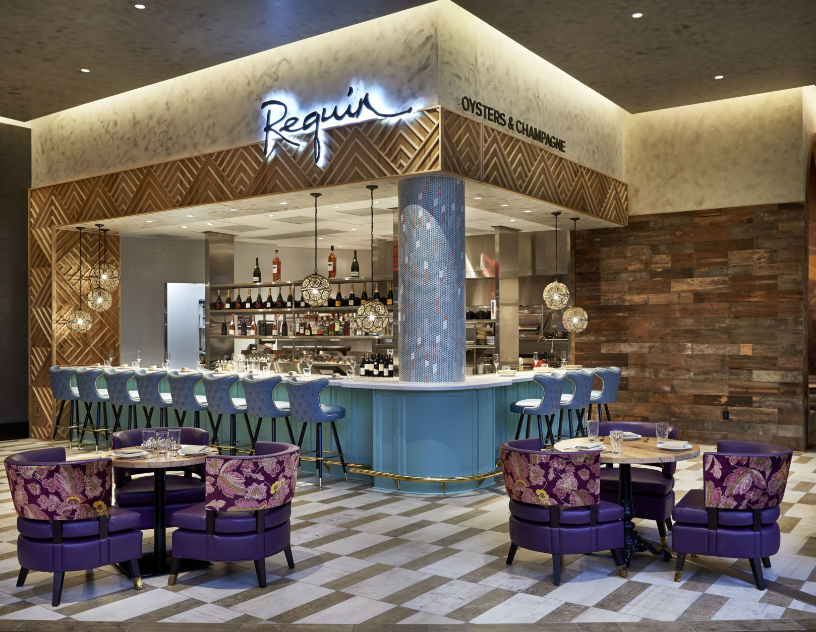
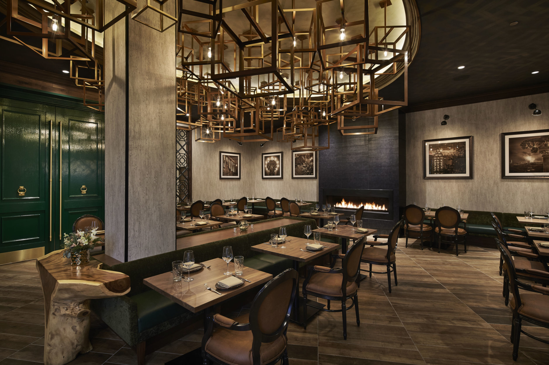
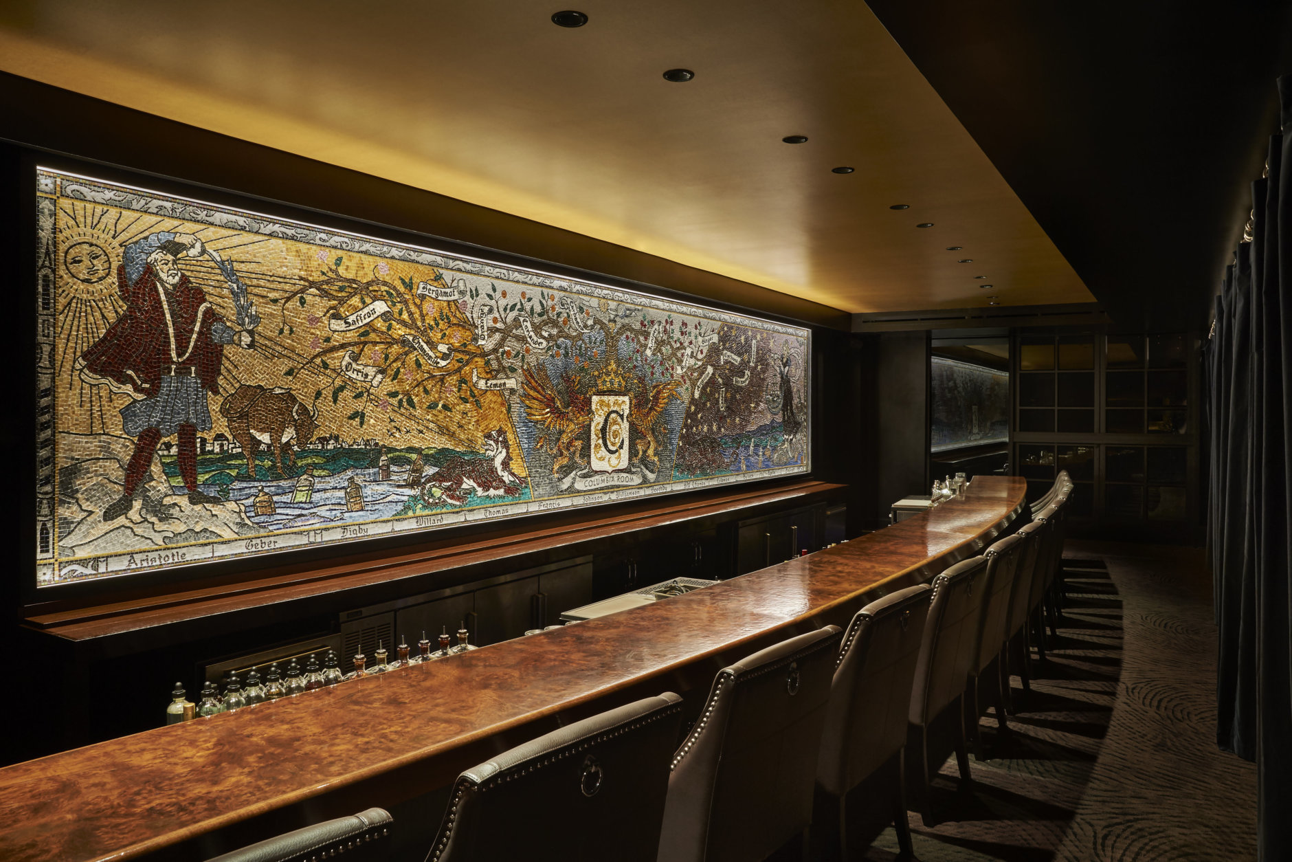
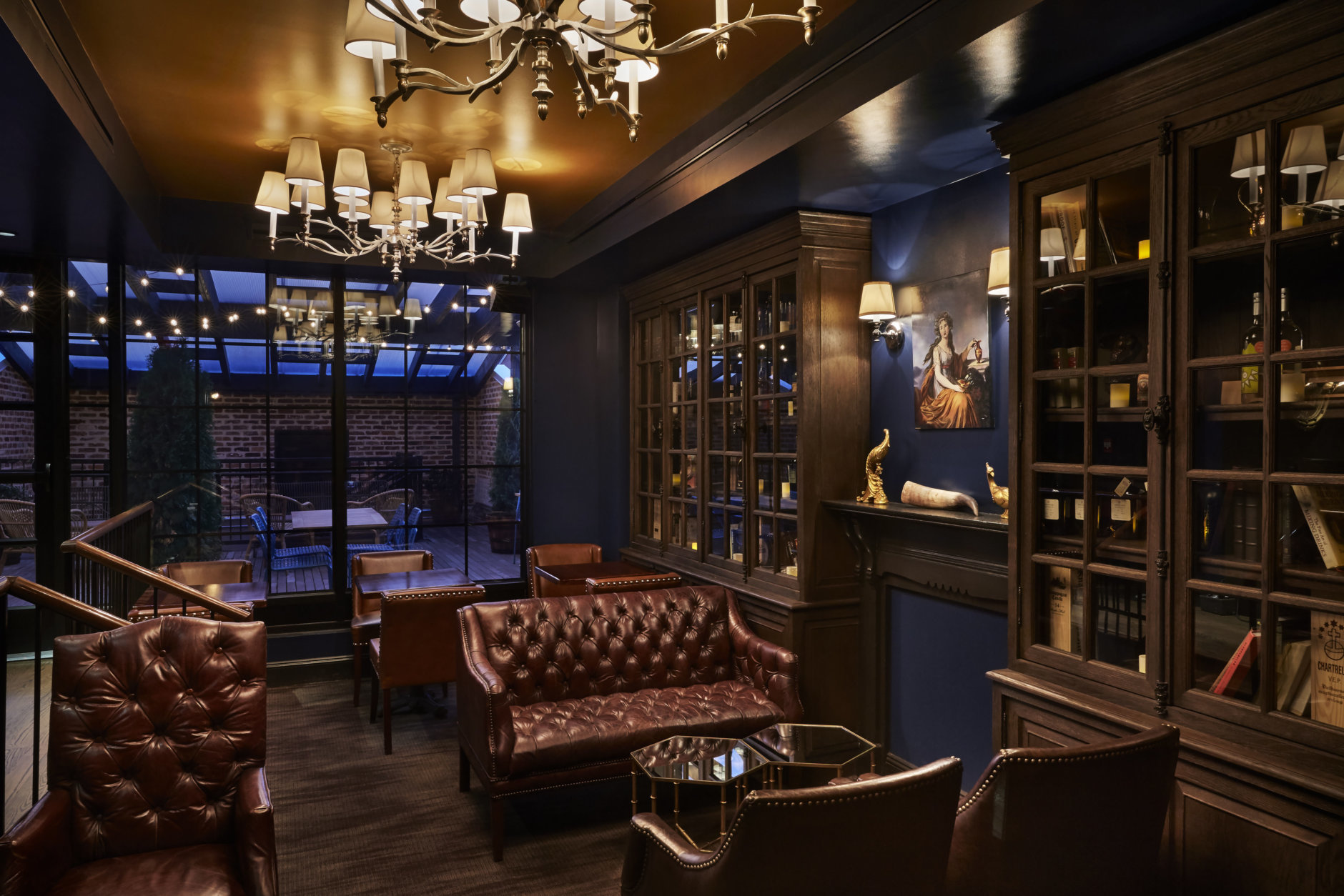
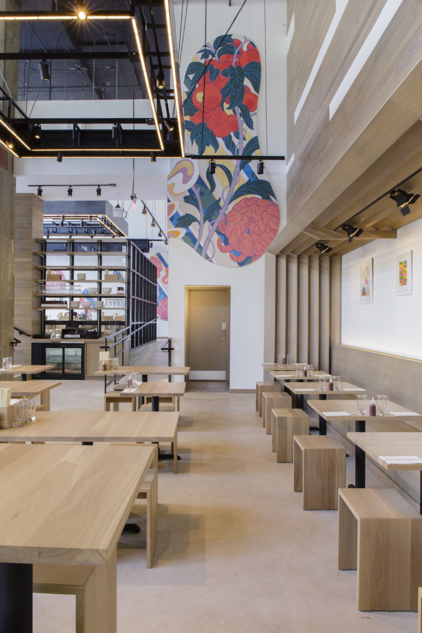

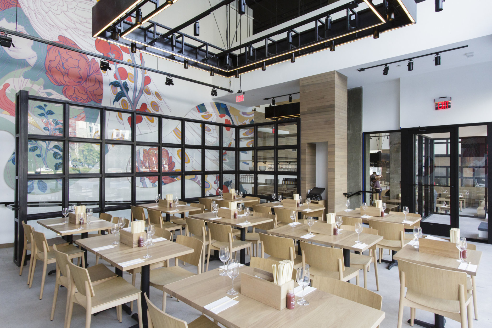
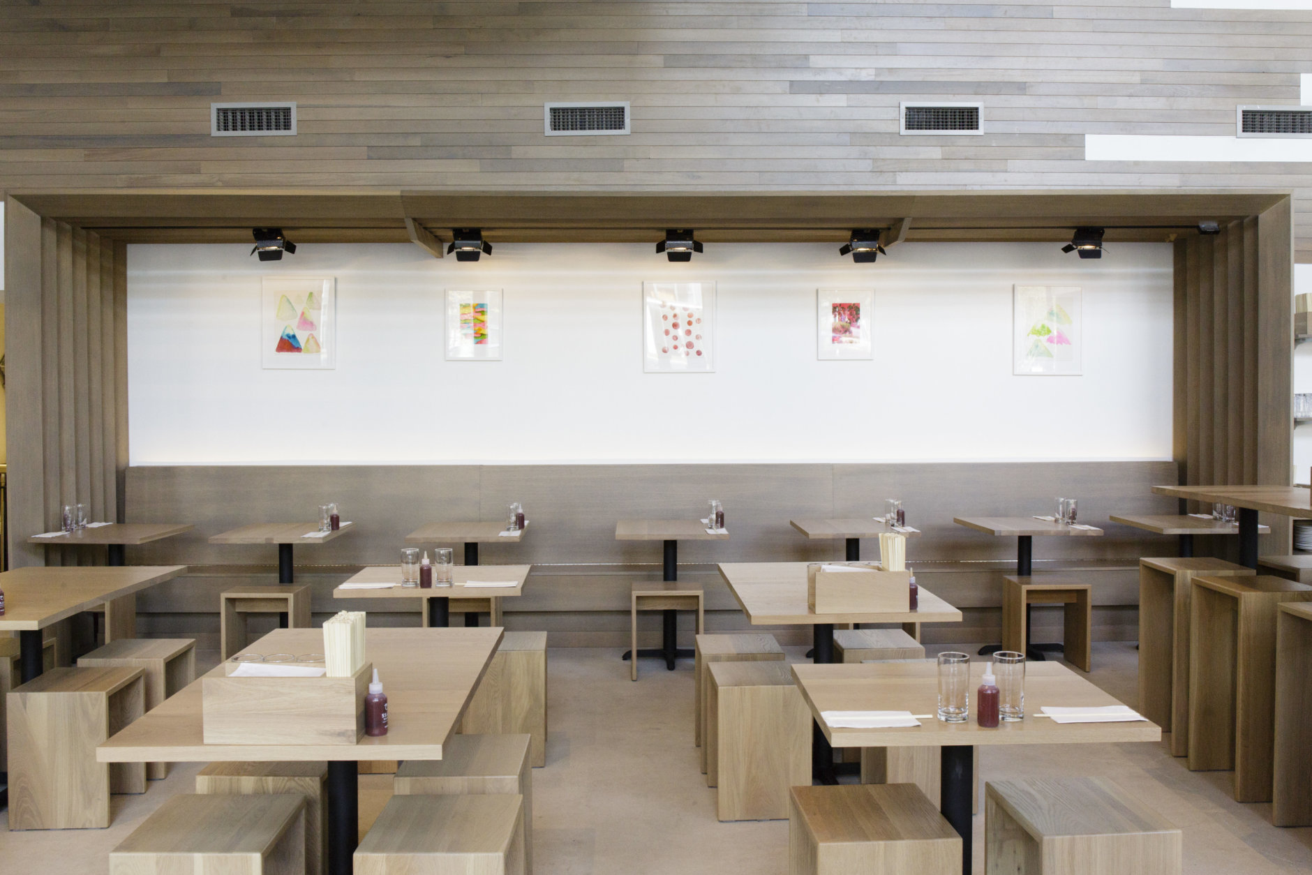
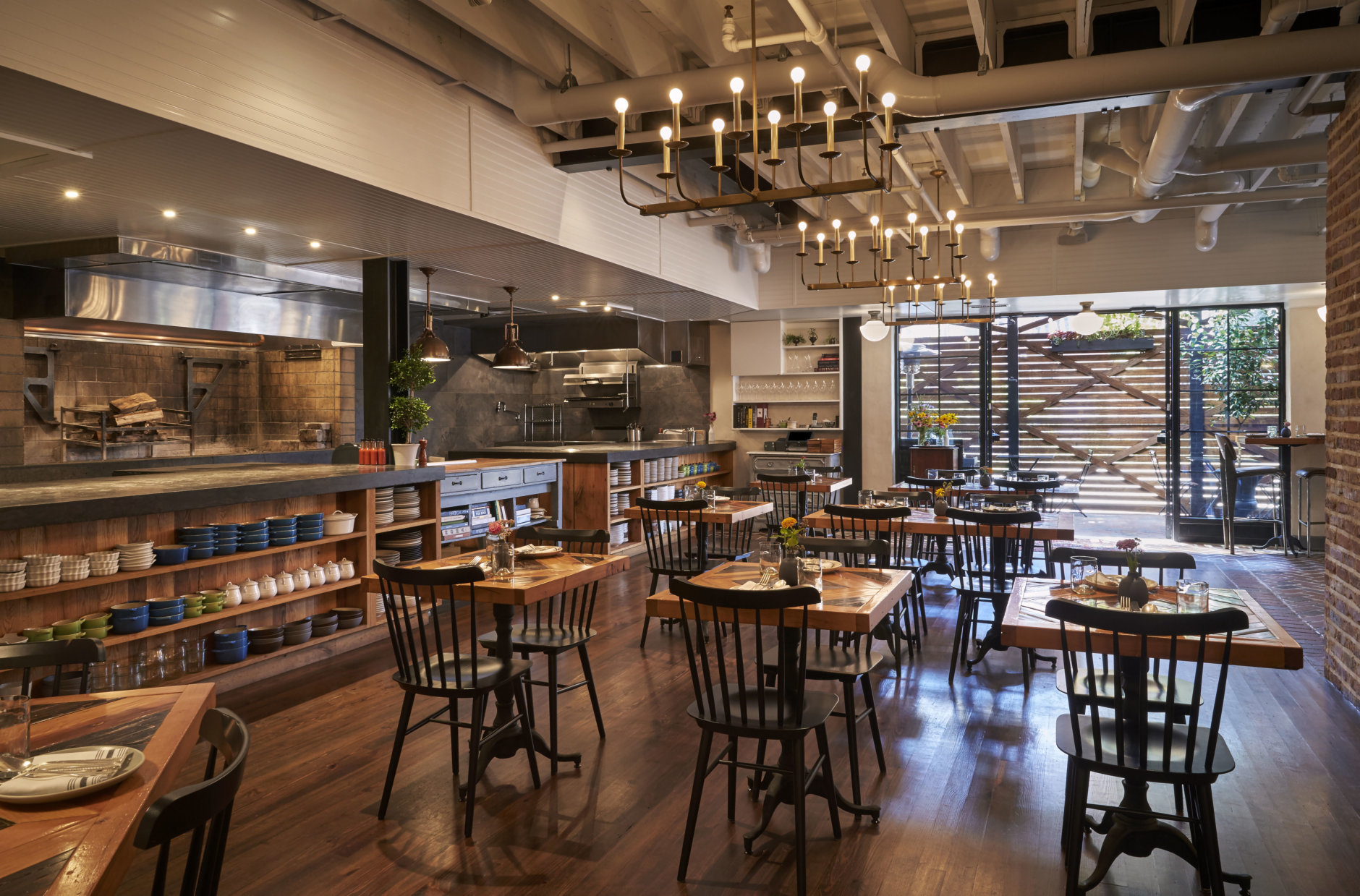
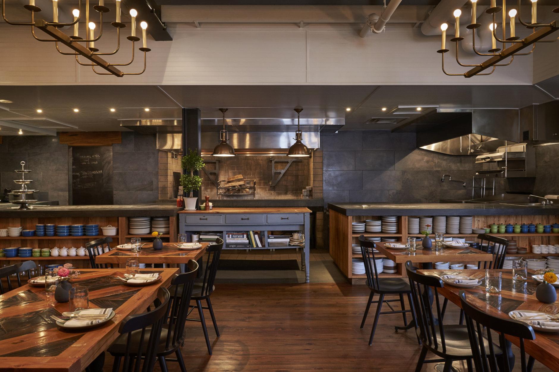
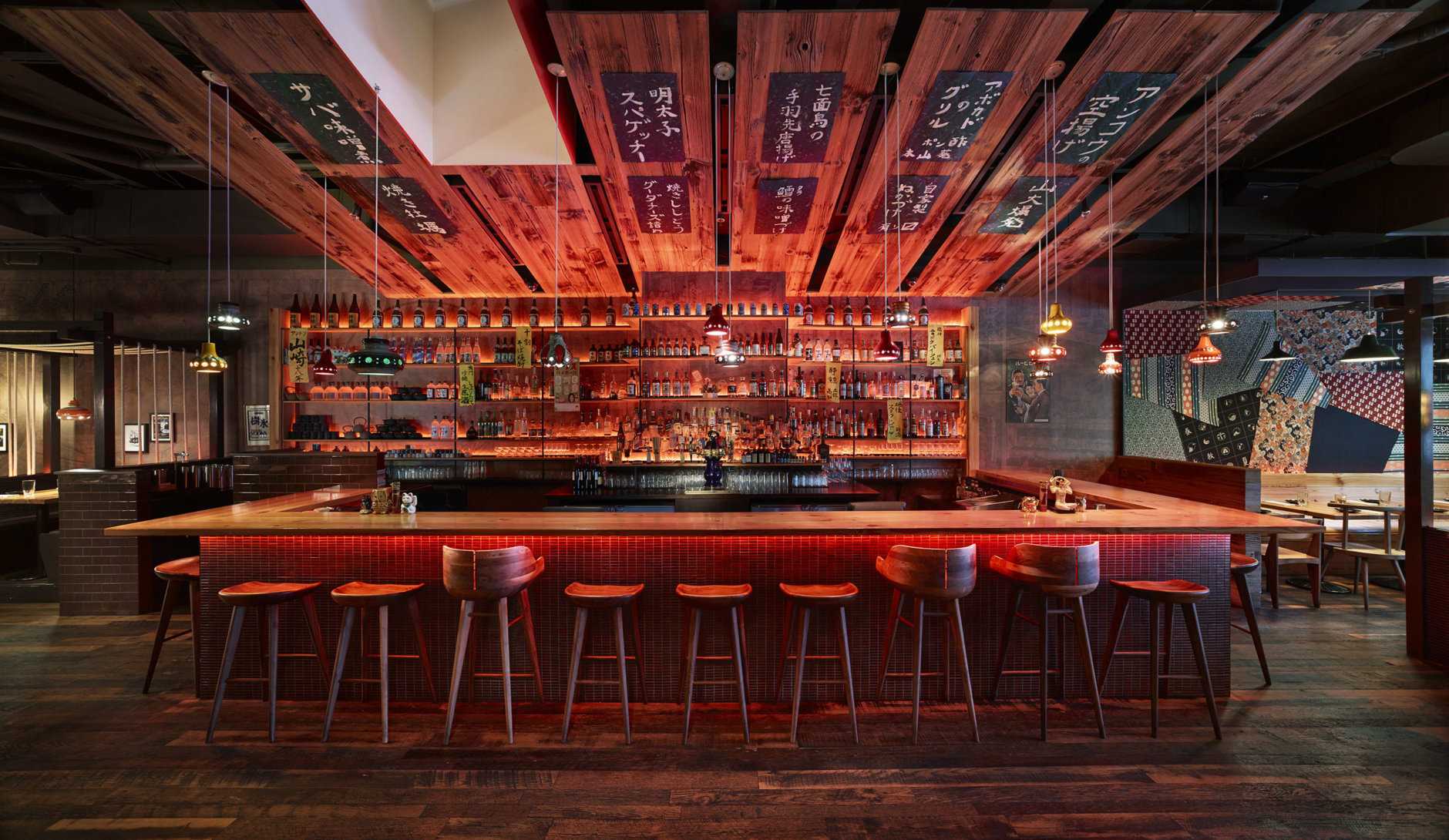
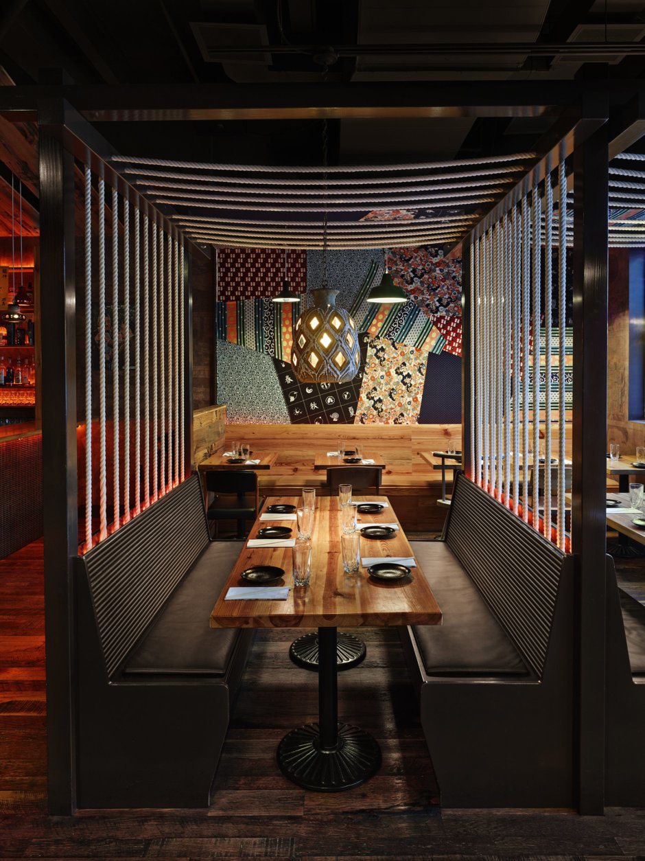
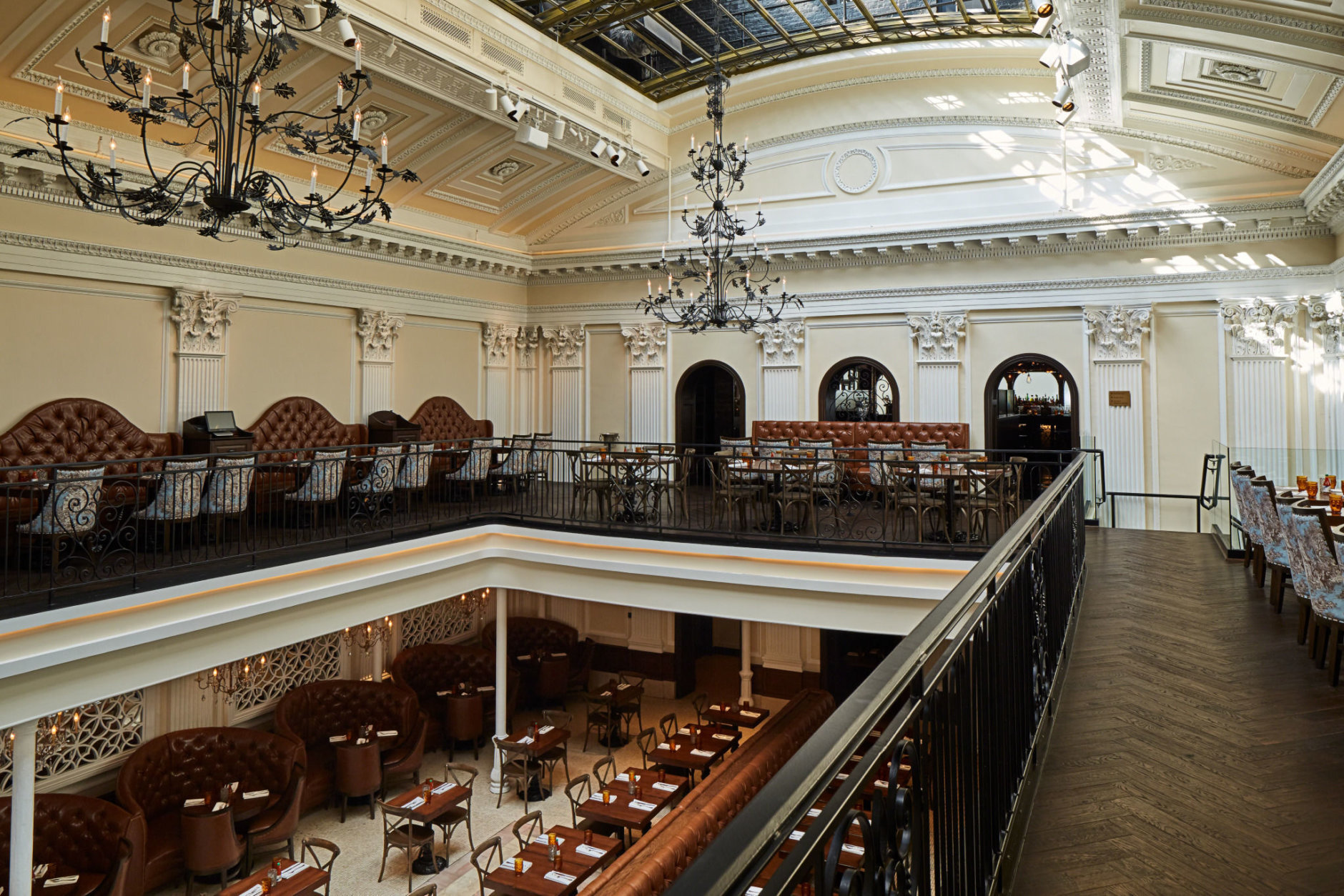
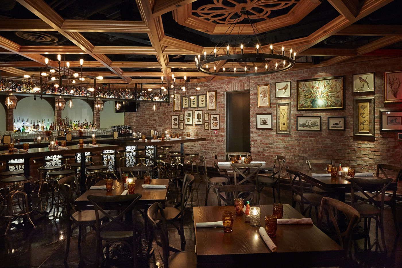


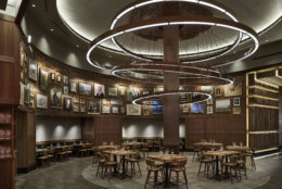
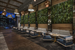
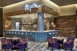
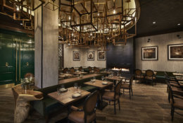
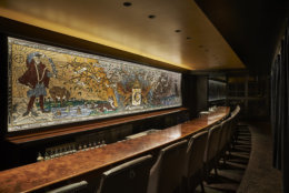
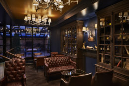
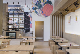
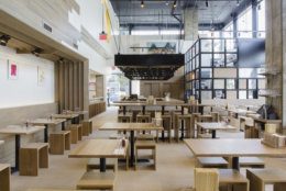
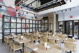

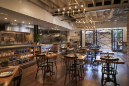
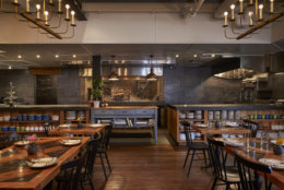
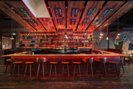
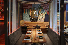
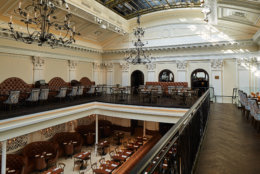
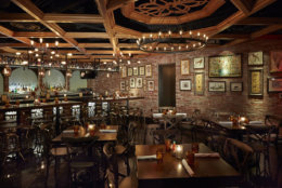
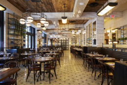
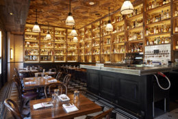
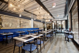
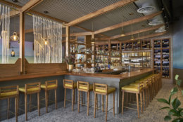
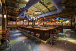
So how does a designer evoke that feeling? It’s theater, so think like a writer: Figure out the audience. Who’s the target customer? What’s the neighborhood? Who’s the chef? What’s on the menu?
“What you’re trying to do is, if you will, create a behavior out of [diners],” said Herb Heiserman, Streetsense’s managing principal. “So you have to be really deliberate in what you choose today to hang on a wall, to put on a floor, to play through the stereo.”
It might require some additional research, and it definitely requires an intimate knowledge of what the client wants. Most come in with some idea, said David Tracz of //3877, but it might require showing them a gallery of visuals to get an immediate sense, then narrowing down those preferences.
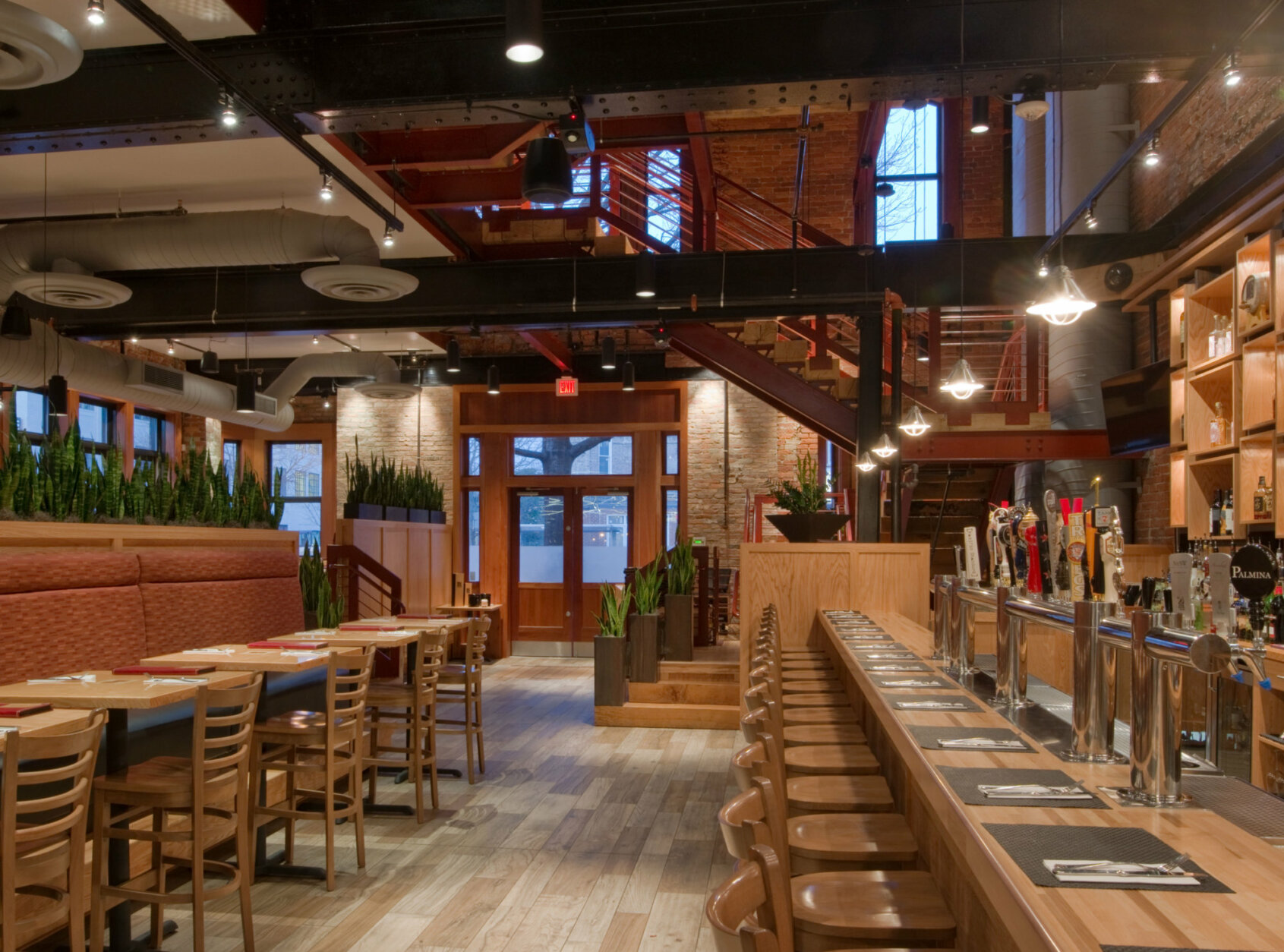
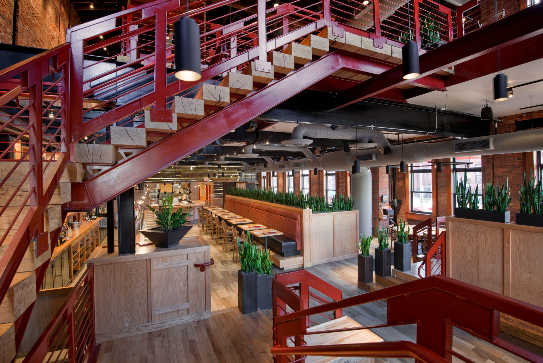
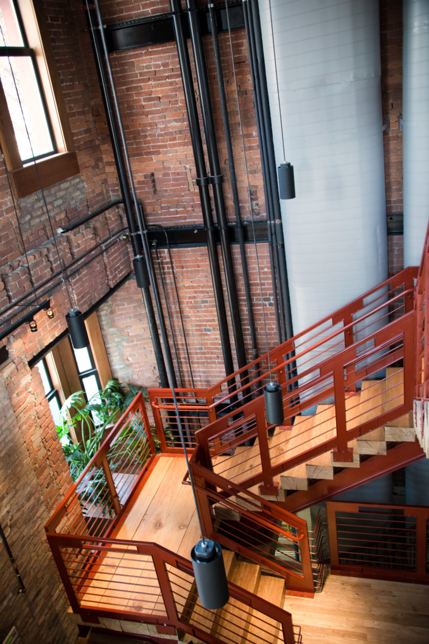
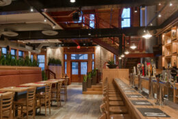
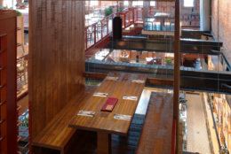
In the case of //3877’s first-ever project — Matchbox’s 14th Street location — they had a good sense of preferences from Matchbox’s other locations, but //3877 had the added challenge of expanding on the established restaurant’s brand in a unique, historic location: the former rehearsal studio for Arena Stage (1901 14th St. NW).
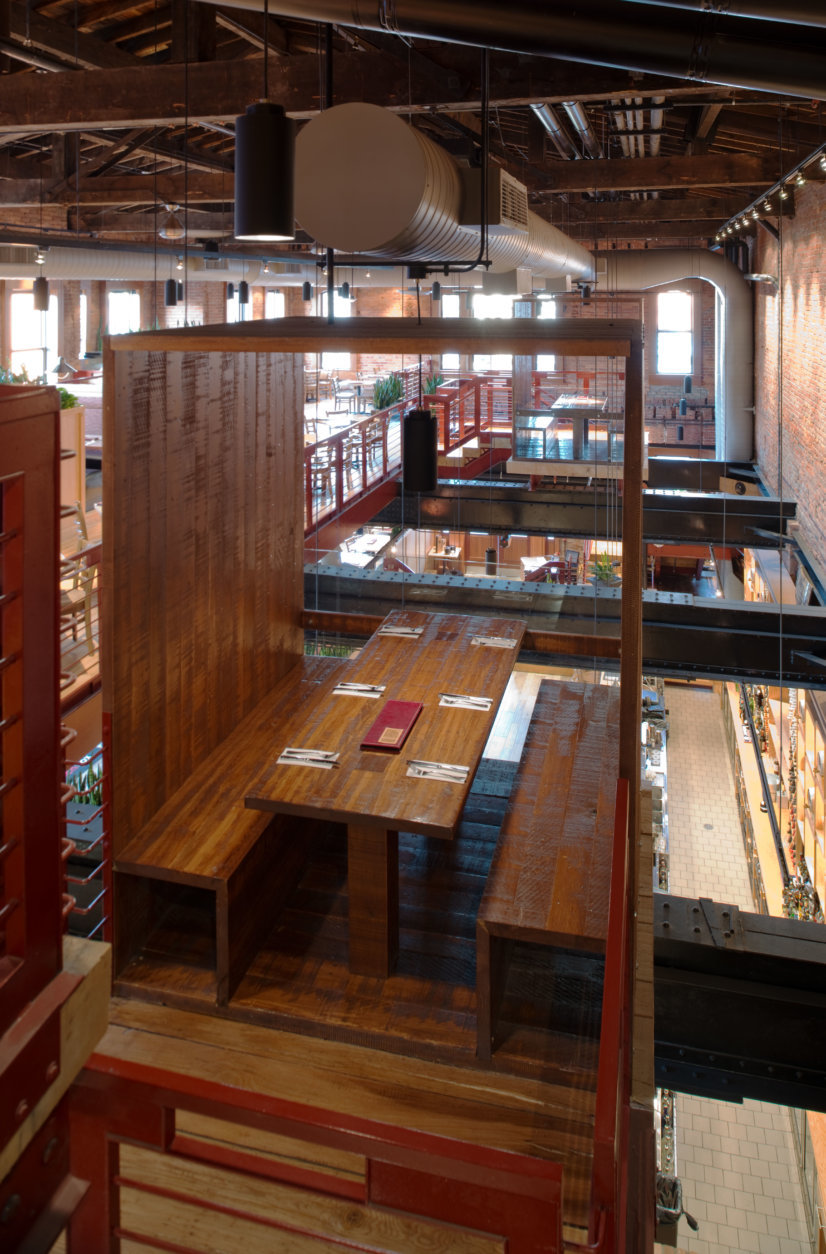
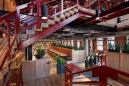
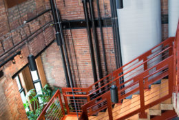
The space, which had also been a jazz club way back when, spans multiple floors. Demolition at the site revealed a steel-and-wood skeleton, which was incorporated into the design, along with exposed brick walls.
Within that, they took an adventurous cue from the Capitol Hill location’s wooden box-shaped booths. In the 14th Street space, two booths (which seat six each) are actually elevated above the bar. “In a two-story space, that’s a pretty exciting place to sit,” Tracz said.
“We were like, ‘OK, if we’re going to push the envelope, let’s get stupid with it,’” said //3877’s David Shove-Brown.
But as they later added, one can’t get too stupid with a vision.
Visual/practical balance
A practical consideration during this visionary process: Chefs and servers have a job to do, too. A floor plan can’t be so exotic that it gets in the way of good business.
“There’s almost mathematical formulas based on ‘How do you circulate around a restaurant?’” said Shove-Brown. “What makes sense? What doesn’t make sense? How do you work efficiently when you’re dropping off dirty dishes and picking up food ready to go out?”
Maringola has a unique perspective on this, which he applies to his design work: He worked in restaurants while in college.
“I think that’s the one thing that a lot of designers today are trying to accomplish — is not just from the experience of the restaurantgoer but the [experience of] who is servicing, who is going to be working behind those back-of-house lines,” he said.
Understanding those fundamental needs, he said, contributes to an easygoing experience for the customer.
Tackling Isabella Eatery
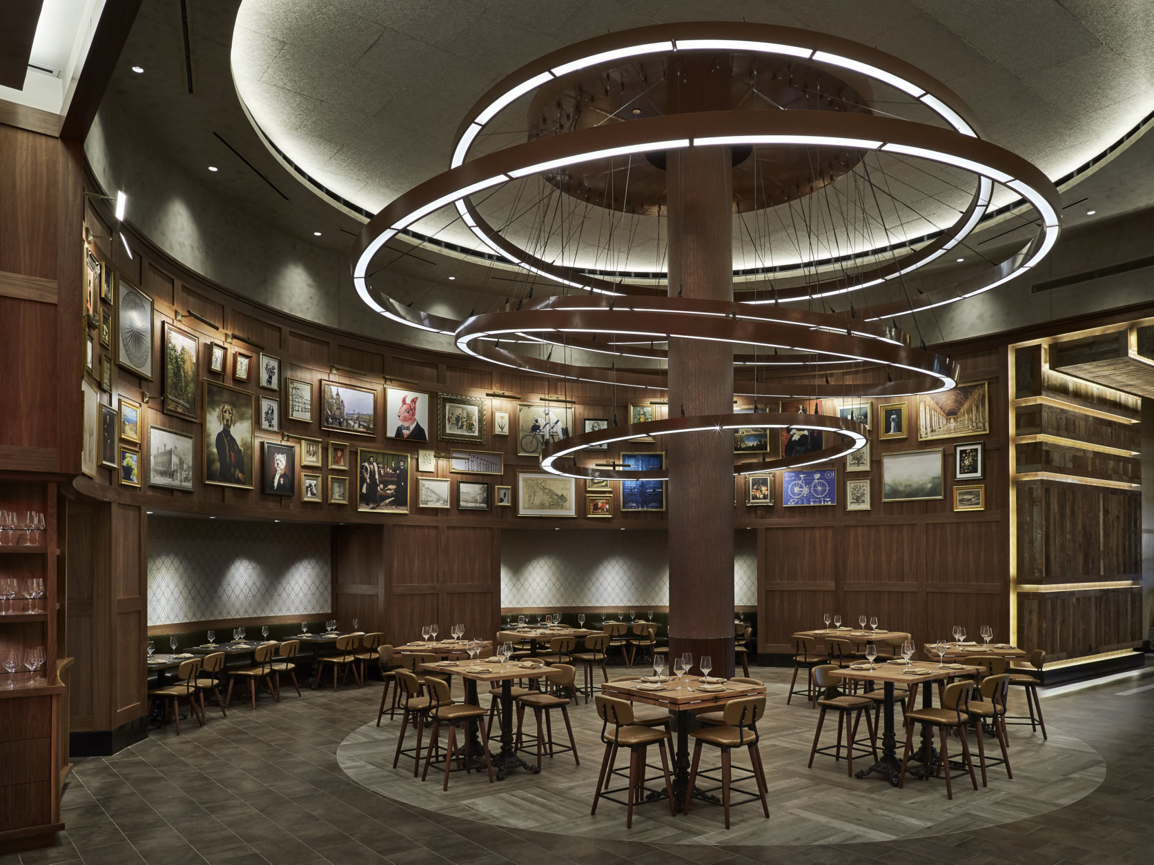
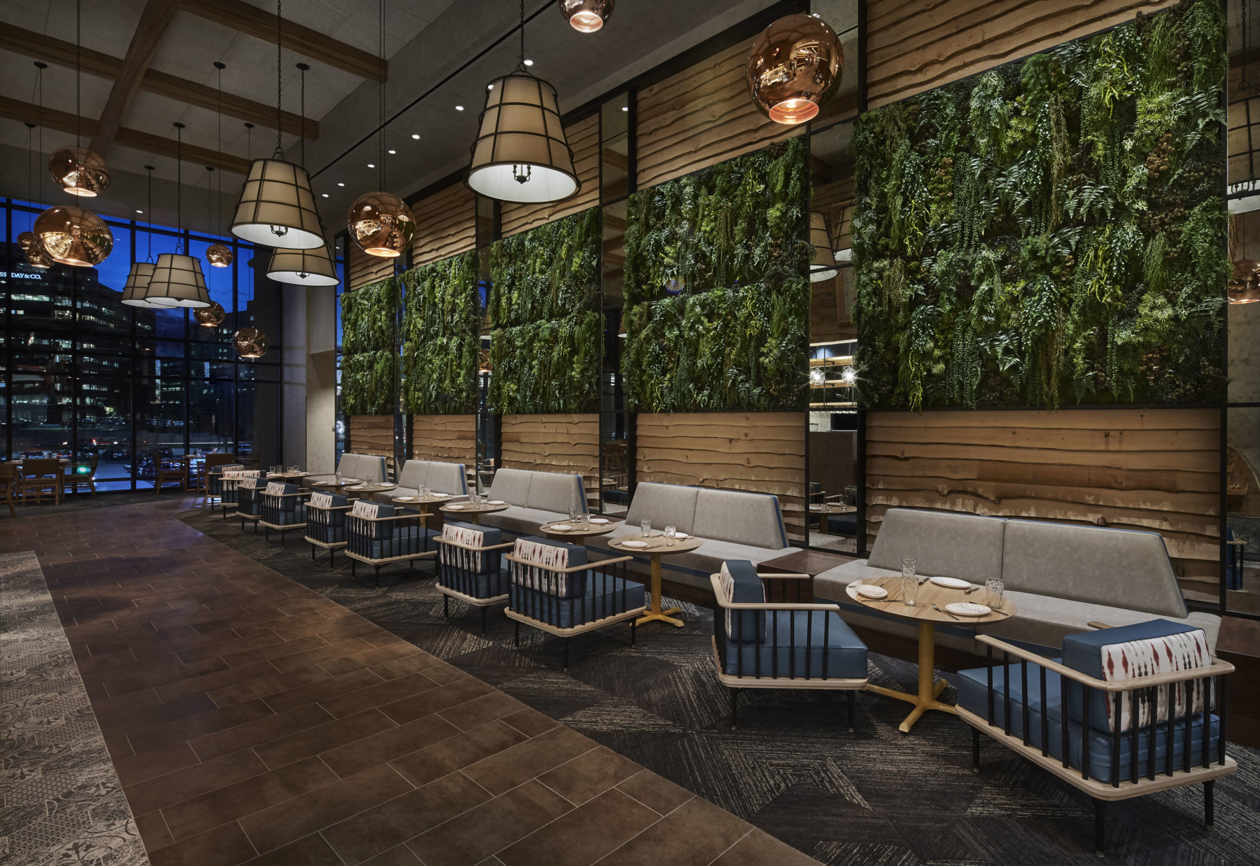
For one noteworthy project — the 40,000-square-foot Isabella Eatery food hall in Tysons — Maringola and Streetsense were tasked with creating a space that comprised several restaurant concepts and dining areas. In a sense, it was nine projects in one at the shopping mall.
Making such an ambitious idea an easygoing experience for an educated, cosmopolitan customer base required a fair amount of thought, Maringola said. What they found: Diners would want a space where they can have intimate moments yet still be in touch with their surroundings.
Maringola is happy with the result. “You’re not forced into being in a restaurant but you’re engaged within the restaurant, and then it also becomes a level of theatrics, which is really nice.”
He singled out Kapnos Marketa’s 30-foot banquette as a feature that facilitates diner engagement. ”It’s this tier effect looking into an open kitchen, and you get to experience what the chef is creating,” Maringola said.
The trend question
Inviting that engagement raises a question: How trendy should the design be? Should one aim, instead, to be timeless? The answer isn’t so simple.
“It’s rare that something speaks to a recurring, demanding customer for years upon years upon years,” said Heiserman of Streetsense. “I think we all ought to understand that it should be timeless as best we can, but timeless changes with time.”
Shove-Brown agreed.
“Even the most classical architecture wasn’t timeless,” he said. “I think part of the beauty of design is that it does evolve and that it does change and allow for that.
“I think that’s the beauty of what we get to do.”
Check out local standout designs from //3877 and Streetsense in the gallery.


