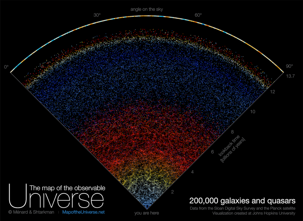
Astronomers at Johns Hopkins University created a new map, which shows the sweeping view of the cosmos from the Milky Way galaxy to the edge of the visible universe.
The interactive map has the actual position and real colors of about 200,000 galaxies. Each dot on the map represents a galaxy, which has billions of stars and planets.
“Growing up I was very inspired by astronomy pictures, stars, nebulae and galaxies, and now it’s our time to create a new type of picture to inspire people,” said map creator Brice Ménard, a professor at Johns Hopkins.
“Astrophysicists around the world have been analyzing this data for years, leading to thousands of scientific papers and discoveries. But nobody took the time to create a map that is beautiful, scientifically accurate, and accessible to people who are not scientists. Our goal here is to show everybody what the universe really looks like.”
Ménard is hopeful that people will understand the colorfulness of the galaxies.
“From this speck at the bottom, we are able to map out galaxies across the entire universe, and that says something about the power of science.”
People can check out the map on the Map of the Universe website.
WTOP’s Dick Uliano contributed to this story.