The popular dating app Tinder launched in 2012, but a look at Tinder’s original patent application from years earlier reveals the app’s signature “swipe right, swipe left” almost didn’t happen.
Filed with the U.S. Patent and Trademark Office on Dec.19, 2008, Patent No. 8,566,327 B2 made no mention of the word “swipe.” Instead, Tinder’s inventors envisioned users would press buttons to indicate their preferences.

Describing its invention with the not-very-romantic title, “Matching Process System and Method,” Tinder’s application said that communication on internet networks by 2008 had become increasingly complex in response to the diversity of online users.
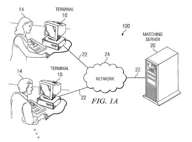
While the first iPhone had just been released in June 2007, the original sketches of Tinder users portrayed them sitting at desktop computers.

“While some believe that on-line dating is simply a matter of matching supply and demand, there is statistical and empirical evidence to suggest that successful online dating entails far more,” according to the patent.
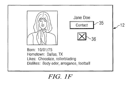
In its application, Tinder’s inventors included rudimentary sketches of a profile a user would view. The button options were labeled “Contact,” to indicate a positive preference, and a stark “X,” which Tinder’s inventors said would “express a negative preference for the entity through (a) dislike button.”

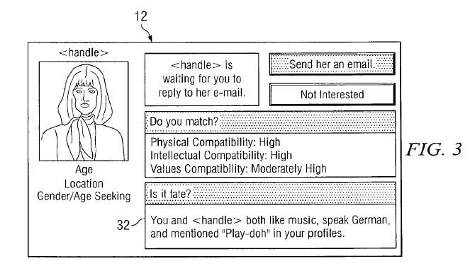
For a potential match, Tinder would break down the two people’s physical, intellectual and values compatibility to give them rankings, including low, moderately high and high, based upon the analysis of Tinder’s matching server.
Original sketches of the interface displayed to a potential match included the teaser, “Is it fate?,” and included the system’s reasons for determining a match: “You and <handle> both like music, speak German, and mentioned ‘Play-doh’ in your profiles.”
Buttons displayed to a potential match were labeled “Send her an email” and “Not Interested.”

Swipe right, swipe left
By the time Tinder developed its initial prototype, co-founder Christopher Gulczynski told Protocol he “made a group of people look like a stack of Polaroid photos. Beneath those were the ‘No’ button, the ‘I’ button for more information, then a green button for liking them.”
Enter the swipe.
Another co-founder, Jonathan Badeen, told CNBC, “Using the buttons to move the cards felt clunky,” Badeen said. “I wanted more fluidity. Finding and selecting the appropriate button felt deliberate and sluggish, whereas in a real world scenario, the decisions we make are quick, subconscious.”
Since Tinder’s first patent was granted in 2013, future patents include swipes as a method of showing preferences.
According to Statista, Tinder, now described as a “Dating, Chat & Friends” app, was the most downloaded dating application in the United States in 2023.
Get breaking news and daily headlines delivered to your email inbox by signing up here.
© 2024 WTOP. All Rights Reserved. This website is not intended for users located within the European Economic Area.


