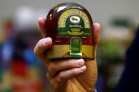
(CNN) — For over 140 years, Lyle’s Golden Syrup — a staple item in any British baker’s pantry — has featured a rather curious logo on its tin: a lion’s carcass surrounded by bees. But now, for the first time since the 1880s, the product recognized by Guinness World Records for having the world’s oldest branding and packaging is undergoing a major redesign.
The company said its new visual identity was designed to “refresh the brand’s legacy to appeal to a 21st century audience.”
Golden syrup, also known as light treacle, is a sweet, amber-colored syrup made from refined sugar that was first produced by Abram Lyle & Sons in 1881. The company’s founder, the Scottish businessman Abram Lyle, chose a logo inspired by the story of Samson who, in the Old Testament, kills a lion with his bare hands only to later discover that honeybees have nestled in the animal’s carcass.
In the biblical tale, part of the Book of Judges, Samson eats honey from inside the lion, gives some to his parents and then presents 30 wedding guests with a riddle alluding to the encounter: “Out of the eater came something to eat; out of the strong came something sweet.”
An alternative wording of the riddle, “Out of the strong came forth sweetness,” has featured on Lyle’s logo since its inception.
The new logo, meanwhile, gives the animal a more abstracted — and somewhat more animated — appearance. Just a single bee remains, located slightly above the lion’s head.
Acknowledging the product’s unchanged branding in 2006, Guinness World Records noted that the only alterations made since 1885 were “slight technical changes during the war due to shortages of materials.” In 2008, to mark the product’s 125th anniversary, then-owner Tate & Lyle announced that it was changing the tin to a gold color, although the logo remained unchanged.
Tate & Lyle was formed in the 1920s when Lyle’s firm merged with rival sugar refinery Henry Tate & Sons. The company, now a major global food and beverage supplier, sold its sugar refining business (including Lyle’s Golden Syrup) to US firm American Sugar Refining, or ASR Group, in 2010.
The product’s old logo will continue to be used on Lyle’s classic golden syrup tin, though its bottles and dessert toppings will all now bear the new branding. A company spokesperson declined to comment on whether this represents a majority of the units sold.
In a statement, brand director for Lyle’s Golden Syrup, James Whiteley, said that “consumers need to see brands moving with the times and meeting their current need.”
“Our fresh, contemporary design brings Lyle’s into the modern day, appealing to the everyday British household while still feeling nostalgic and authentically Lyle’s,” he added. Still, the redesign was met with mixed reactions. On Instagram, designer Laura Evans described the new logo as “contemporary and clever.” She added: “It cuts the fuss and gets straight to the point, whilst retaining the core essence and magic. It says more about the product’s texture and feel than the etched lion surrounded by bees did.”
Others however, including several Christian commentators, were less complimentary. “This is what happens when brand managers get involved: take a story that has survived 2000 years and ‘refresh’ it (i.e. ditch it),” author Colin Freeman wrote on X.
The-CNN-Wire
™ & © 2024 Cable News Network, Inc., a Warner Bros. Discovery Company. All rights reserved.


