

WASHINGTON — Choosing between form and function is a common challenge many homeowners and renters face.
All too often, people feel stylish rooms ripped straight from the magazines can’t be lived in, and that functional family rooms are rarely beautiful. But Young House Love blogger Sherry Petersik says that does not have to be the case.
“Life has to be lived in your home,” she says. “And there are some strategic choices you can make so that those two don’t have to be mutually exclusive.”
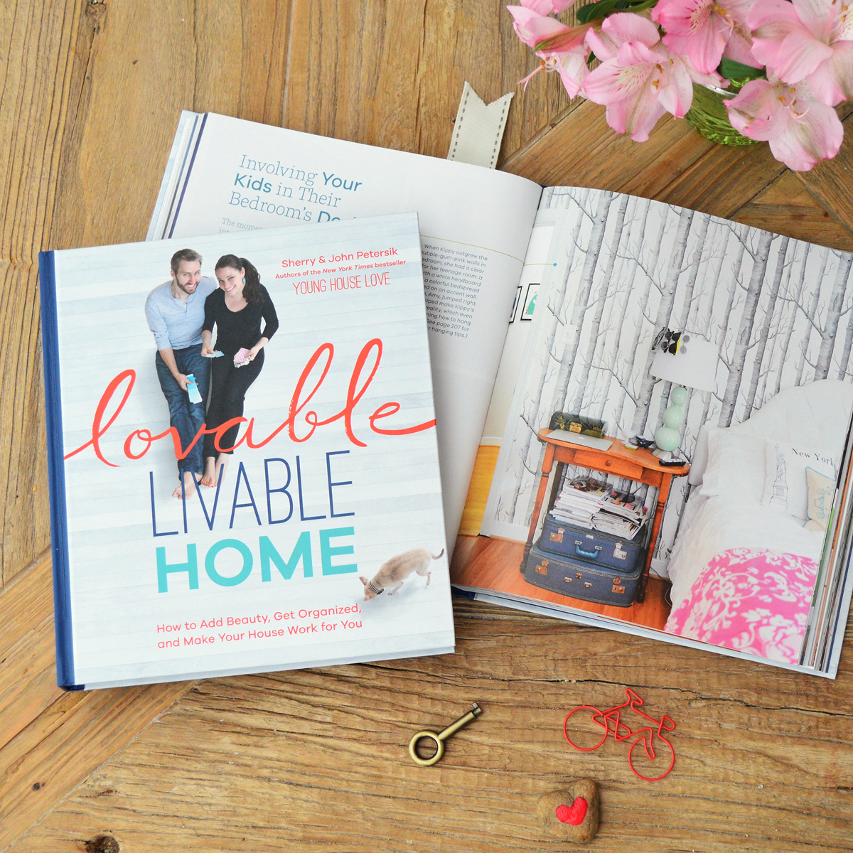
In the new book “Lovable Livable Home,” Sherry and her husband John Petersik offer simple DIY solutions to everyday dilemmas — from choosing chic, yet kid friendly furniture, to creating a useful entryway space.
Be smart with materials
One way to ensure your interior still shines despite life’s inevitable wear and tear, is to choose materials that can stand up to everyday spills, scratches and beatings. For example, a leather sofa is a piece that looks better with age — even after apple juice spills, pet scratches and the occasional trampoline session.
Another piece to consider for a style-forward yet functional living space is an acrylic coffee table.
“We’ve learned lots of families with young children don’t want glass, they don’t want the pointy edges, and a lot of times acrylic tables have a curved edge,” Sherry says. “They’re wipeable too, they don’t get drink rings, but they’re very kid friendly.”
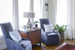
Make an antique your own
Sherry says one question she and John often receive from readers is how to breathe new life into an antique or handed down piece of furniture. She says there’s a lot of guilt when it comes to changing or enhancing an old piece that’s been gifted from a friend or relative, but it’s often unwarranted.
“When you give someone a gift or you pass something along to someone, you want it to bring them joy. You certainly don’t want them to suffer or hate the piece. And a lot of times when someone is giving something or passing it down, it’s because they don’t want it anymore,” she says.
A few small changes can really make a big impact. For example, replace old knobs and pulls with newer, more modern hardware to bring furniture up to date. If you want to keep the antique look but change the color, Sherry says chalk paint is the way to go.
And simply removing an attached mirror from an old hutch can help scale down the size of a large, bulky dresser. When Sherry had John had an old piece of furniture that was too beat up to be saved, they salvaged the drawers and turned them into shelves to hang on the walls.
“So it’s sort of a memory of the piece of furniture, even though the furniture was past its prime,” Sherry says.
If you find your style is more modern than vintage and prefer not to keep an antique, John says sit tight for a minute before you pass it along, and test it out in a room.
“It’s always helpful to have a little bit of age in a room or something that might contrast with some of the newer pieces you’ve bought,” he says.
You may also find it brings in some extra meaning, beyond just conforming to your style.
Changing the mood is as simple as changing the paint color
In “Lovable Livable Home,” Sherry and John tackle projects in their own home. And one of their biggest transformations is their living room. John says when they bought the house, the living room, which doesn’t receive much natural light, had dark wood and dark walls.
“It really just felt almost like a black hole in the corner of our house,” he says.
To brighten it up, they painted everything white — from the walls, to the beams to the brick around the fireplace.
“We just knew to maximize the lightness of that room, we really needed to have the walls work really hard for us,” he says.
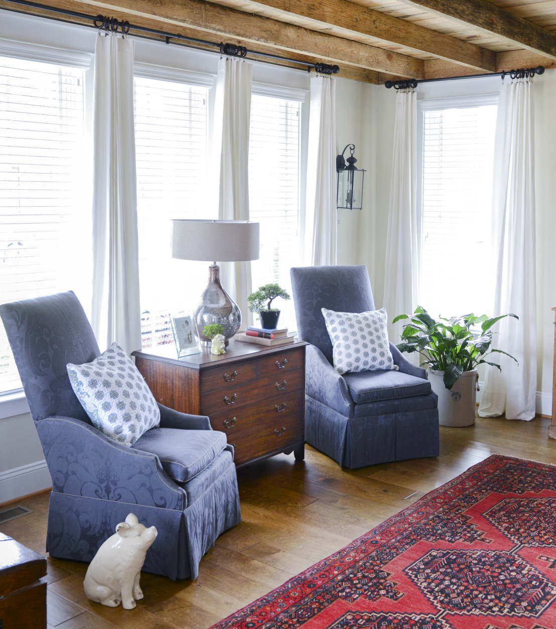
To keep the room from feeling too stark, the couple brought in colorful accent elements, such as an old Persian rug. They also painted the ceiling blue.
An entryway doesn’t have to be extravagant
There’s nothing better than having a place to hang your hat — literally.
A designated space for keys, mail, bags, boots and pet leashes is a must for many families. But before you go drawing up construction plans for a Pinterest-perfect mudroom, consider simplicity.
John says a good test is to walk in the door and drop everything you’re carrying: “Put your keys, your bags, your coat down, and just take a quick inventory of the things that you’re bringing in to the house, and then really be thoughtful about how you can designate spaces for your things.”
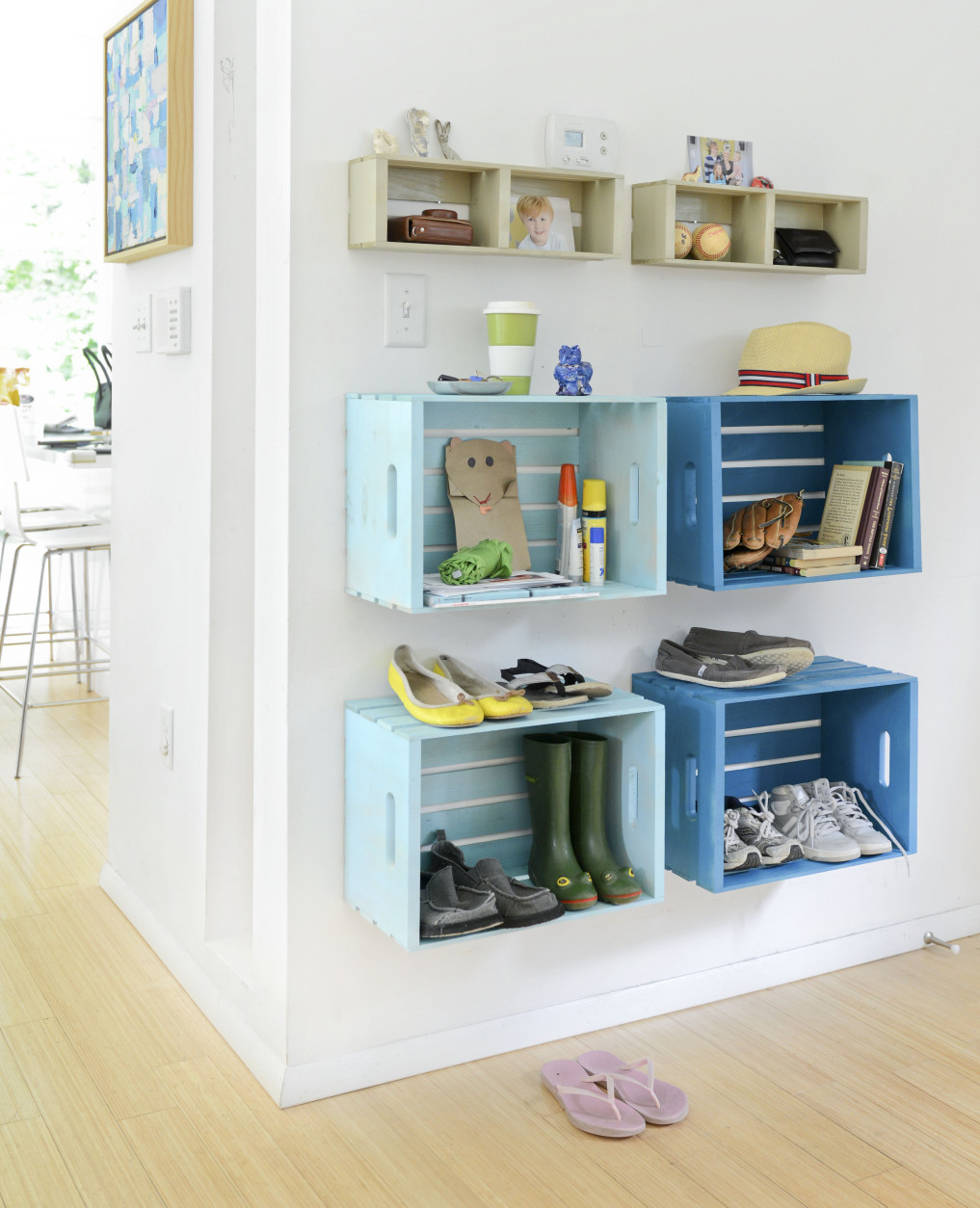
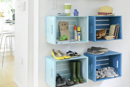
Sometimes a few hooks from the hardware store, or a shallow shelf with a key bowl, are all you need. In their latest book, John and Sherry create an entry space with wooden crates from the craft store. The painted crates create a visually appealing entryway, and also have plenty of surfaces for shoes, bags and decorative items.
Go vertical
Even if your home is large, clutter can collect if all of your frames, candles and vases are on horizontal spaces. The best way to design a clutter-free room is to take advantage of the walls, Sherry says.
In a kid’s room, for example, move homework supplies to a board or shelf that hangs above the desk.
“I just think it’s one of those things where now, instead of walking into a room and having to search for something, or seeing a pile of junk in a drawer or on the table, there’s this nice illusion of control and order,” Sherry says.
In the kitchen, create a coffee-mug wall by hanging cups on gold hooks.
“Hanging your mugs that way is so charming. It’s sort of like kitchen art, but it’s also a great solution because in these small places where you might not have room for all of your dishware and your mugs, it’s a perfect solution for storing that stuff,” she adds.
Find ways to display kid’s art
It’s that time of year when kids are coming home from school with piles of artwork. Instead of cramming it all into a drawer, find creative ways to display their masterpieces throughout the house.
One solution is to give your Picasso a pin board so he/she can proudly pick which pieces to show off.
“But obviously we can’t just fill one board and call it done because these kids are prolific,” Sherry jokes. So she has some other ideas for incorporating art throughout the home.
One of her favorites is to cut fun shapes out of cardstock — such as a fish, a heart or another design — to make a matte for a frame. Then, put a colorful scribble piece of art behind the matte.
“It amuses the child because they suddenly see a shape in their drawing; it sort of enhances the scribble. And it makes a really cute project — it’s a great gift for the grandparents,” Sherry says.
Washi tape is another decorative way to display projects. Sherry says these days, you can find the colorful tape anywhere and in any color. Plus, it doesn’t hurt walls when it’s time for the painting to come down.
Want to ask Sherry and John a design question in-person? Catch them at the West Elm on 14th Street Wednesday, Oct. 14 at 6 p.m. for a book signing.


